
Cross Plots
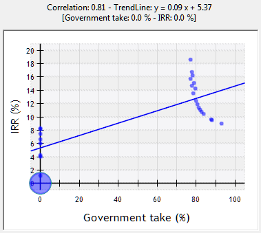
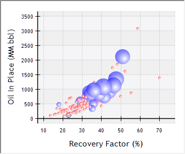
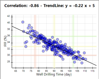
This node allows you to create a cross plot of any two probabilistic inputs or results selected for the Monte Carlo run. Highlight any variable in the y-axis and x-axis list to create the plot: iterations will be represented by blue circles, with the trendline represented as straight line that minimizes the orthogonal distance between the points and the line; larger circles indicate that more iterations presented the same value. The general degree of correlation and the trendline equation are also shown above the graph; the position and slope of the trendline is calculated using linear regression from the plotted values. Select one iteration to view the values assumed by the two selected variables, and the number of iterations where these values were the same.
They can also be grouped as clusters, according to the value assumed by Boolean variables for which a distribution has been defined; in other words, variables which represent decisions that created divergent branches in the simulation. Clusters and cluster trendlines are represented by distinctive colors:
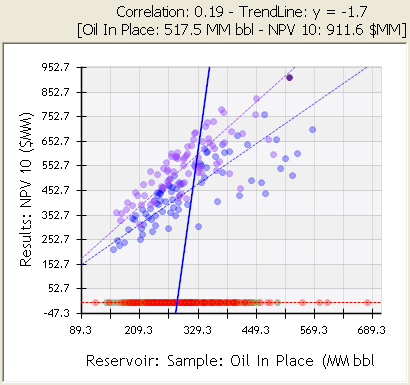
A third parameter can be added to the graph by means of the Show Z variable option in the right-click menu. This option allows you to add a result or variable, whose value will be represented by the size of the bubble in the plot - positive values blue, negative values red. This mode makes it possible to relate the value assumed by a variable to the crossing of the two variables being plotted:
Use the  P10 Zone,
  P50 Zone and
  P90 Zone buttons in the top corner to show these zones in the graph; then you can select iterations that fall within them to create P10, P50 or P90 scenarios using the

 buttons in the toolbar or the right-click menu.
When a bubble cross plot is exported to Excel, it will show negative values with a scale no greater than 60. This might produce Excel bubbles that are too small to be visible. If this happens, you should modify the Excel scale to a larger value. PetroVR uses this max of 60 to avoid disproportionately large bubbles in the Excel plot.
If the Z variable of a bubble cross plot adopts undefined values (e.g., with IRR), the Excel export of the plot will transform them to zeros and there will be no visible bubbles.
The right-click menu offers the following options:
- Show Trendlines.
- Show Clusters.
- Show Z variable: Enable a third parameter in the graph (bubble chart).
- Choose Z variable: Select a new variable as third parameter.
.png) Save selected iterations as projects: Create a new project (.pvr file) for each selected iteration. Enter a file name and location. Values with a probability distribution will present the value assumed in the iteration, defined deterministically.
Save selected iterations as projects: Create a new project (.pvr file) for each selected iteration. Enter a file name and location. Values with a probability distribution will present the value assumed in the iteration, defined deterministically.  Create Scenarios for Selected Iterations: (Also available as a short-cut in the upper left corner.) Open and edit the selected iterations with the Scenarios tool - see Scenarios from MC Results.
- Create P10 / P50 / P90 scenario: Create a scenario with the selected iteration, if it falls within one of these zones.
- Select same Cluster(s): Select all iterations belonging to the same cluster(s) as the ones selected.
 Copy to Clipboard:
  Export to Excel: Export as an Excel bubble chart.
  Copy Plot Data to Clipboard: